What is a Mobile Friendly Website
Have you heard the news about the looming deadline for all websites to be Mobile Friendly? What is a Mobile Friendly website? I will explain what it is and how to tell if your website will pass or fail. This is a must have bit of knowledge to avoid having your search engine rankings taking a negative hit.

What is Mobile Friendly?
A website being Mobile Friendly is pretty much what you may expect it to mean from that terminology. Basically it is any website that will function properly within the confines of a smaller viewing area. Many websites that have templates like WordPress, will be what is known as “Responsive” which means that they can seamlessly adapt to different sized screens.
This is the best solution for both the desktop and the mobile markets. This way the themes will be compatible for both, preventing the website designers from having to develop two separate versions of the website. Responsive themed websites are Mobile Friendly.
However there are other concerns, other than the responsiveness of the overall theme and look of the website, that are taken into consideration as to being Mobile Friendly. There is also the design of your content that is taken into the compatible consideration.
If you have text that is too small, even for desktop, it will not be good for mobile. Another no go would be if you have links placed too close to one another, either side by side or above and below one another. Though these may be fine when using a mouse pointer, they become more difficult as touch zones with thicker fingers on a smartphone.
How to tell if your website is Mobile Friendly
So now that you know what Mobile Friendly means, how do you go about checking to see if your website is compatible with the April 21st deadline? There are a three things you can do. The most obvious thing would be to view and operate your entire website from a smartphone.
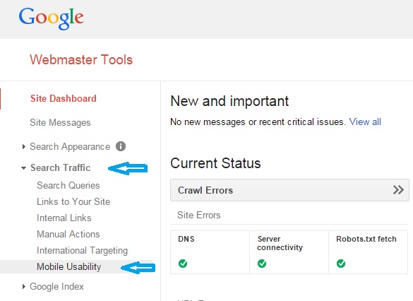
Even if it seems alright to you, I would recommend that you do the following two tests as well. You will first want to go to the dashboard status area for your website in Google Webmaster Tools (GWT). Then in the left side menu you will want to select “Search Traffic” and then “Mobile Usability” to check your overall website compatibility (See Above Image).
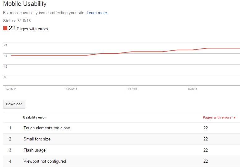
If GWT finds a problem with any pages on your website, it will list the problems that were found and the amount of pages they appear (See Below Image). You will then be able to click on each of the problems and see exactly which pages they appear on.
Google Mobile Friendly Test Tool
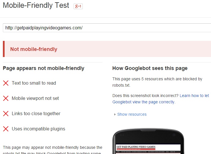
Though the above tests are good to perform, Google has offered a specific testing tool for websites compatibility of Mobile Friendliness. With this testing tool you can analyze each individual page and post. This tool is called the Mobile-Friendly Test.
When you input the URL of a website page or post into the testing tool and click “Analyze,” the testing tool will check your entire page and let you know if there are any problems. You can see an example of what it will look like on a mobile phone as well, (See Below Image).
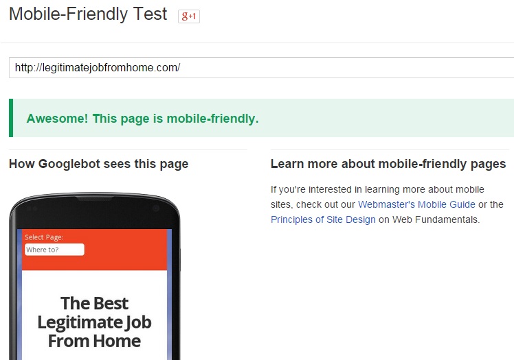
However if you were to check the URL of a website page or post that had no issues, like what I did with this website, you would see the tool proclaim “Awesome! This page is mobile-friendly.” Again it will show what the page will look like on a smartphone, (See Below Image).
STAY UP-TO-DATE WITH THE LATEST IN WEBSITE DESIGN
The Google Deadline is Fast Approaching
At the posting of this blog, the Google deadline for all existing and new websites to be Mobile Friendly is a little more than a month away. Make sure you test all of the pages and posts on your website and take action right away if there happens to be a problem.
If the deadline comes and you are not yet compliant, your web pages, posts or your entire website will take a hit in the search engine rankings and will NOT be visible in mobile search results. Being that mobile search has surpassed computer search traffic, it is important to make sure you are mobile friendly and not fall out of sight with the mobile market.
Now that you understand what is a Mobile Friendly website, use these testing tools now to see if your website pages and posts are good to go or need alterations. If you have completed the changes, I highly recommend that you re-index your content by using Fetch as Google. This will get your content indexed into Google within a couple of hours.
Hopefully these tests will show that your websites are Mobile Friendly and no changes will need to be made. If you have any questions on what you have just read, please leave them below and I will return with a reply. Please share this on social media so that others will know of this deadline. Thank you!
https://legitimatejobfromhome.com/what-is-a-mobile-friendly-website/What is a Mobile Friendly Website - A Google Ranking Factorhttps://legitimatejobfromhome.com/wp-content/uploads/2015/03/What-is-a-Mobile-Friendly-Website-5.jpghttps://legitimatejobfromhome.com/wp-content/uploads/2015/03/What-is-a-Mobile-Friendly-Website-5-300x300.jpg2014 & 2015Google,SEO


That’s very helpful, thanks!Mobile access to your site is becoming more necessary than most people think.The only thing that will never work well on mobiles is typing,they are all just slow.
I personally am not a fan of using mobile to surf the net and when I do it is on a tablet/iPad. But it is impotant to be mobile friendly especially if you want better SEO rankings and access within mobile search.
Nice post!
Em a very old reader of your blog and helped me alot in getting knowledge making money.
You are welcome Haris and I am so glad my blog has been able to help you to make money online.
Nice Post !
But I have a question isn’t that the mobile friendly website which have mobile responsive template ?
coz i have have heard from somewhere that mobile responsive website is is mobile friendly and google prefers it !
Yes, a website that has a mobile responsive template is also considered as a Mobile Friendly website. One of the reasons why people who have a WordPress website are liked by Google is because he majority of WordPress theme templates are mobile responsive.
You are welcome Vanessa! I am happy your website has passed the test and you will be good to go once the deadline comes on the 21st of April.
Great post with some awesome advice. I totally agree with what you say as it is very important these days to have your site mobile friendly due to the surge of smart devices that are being used.
Practically everyone has a smartphone nowadays and more people surf the web with them than they do with computers, so having a website that is compatible is very important if you want to stay in touch with your audience.
Never heard that there will be another update. Thanks for this article. Now I am wondering what animal will they use to name the update this time.lol.
Seriously though, i wanted to change the theme of my site because it is too mediocre and I got interested in an awesome theme. But I checked my GWT out of curiosity and a little bit of paranoia just to see the mobile friendliness of my site and thankfully it is mobile friendly. I guess I have to be more focused on user experience than great design.
Yes, User Experience is an absolute must over visual design. If a website looks really cool but is not user friendly, people will not stay on your website no matter how cool it looks. If you had a difficult time using a website, would you continue using it? Absolutely EVERYTHING has to cater to the User Experience if you want great SEO. It has always been that way but people for some reason forget about the user and focus more on the search engines.
Robert,
Fantastic post I was not aware of any deadlines so thank you for letting me know. Luckily all my sites passed the test so hopefully that will mean an increase in traffic come deadline time!
Brok
That’s awesome Brok! One thing is for certain, you will not lose the chance for more traffic.